Brand identity design across a range of industries, from pharmaceutical to community organizations. Each project starts with understanding what the brand needs to communicate, and builds from there, through simple forms and conceptual metaphors that make an idea instantly recognizable.
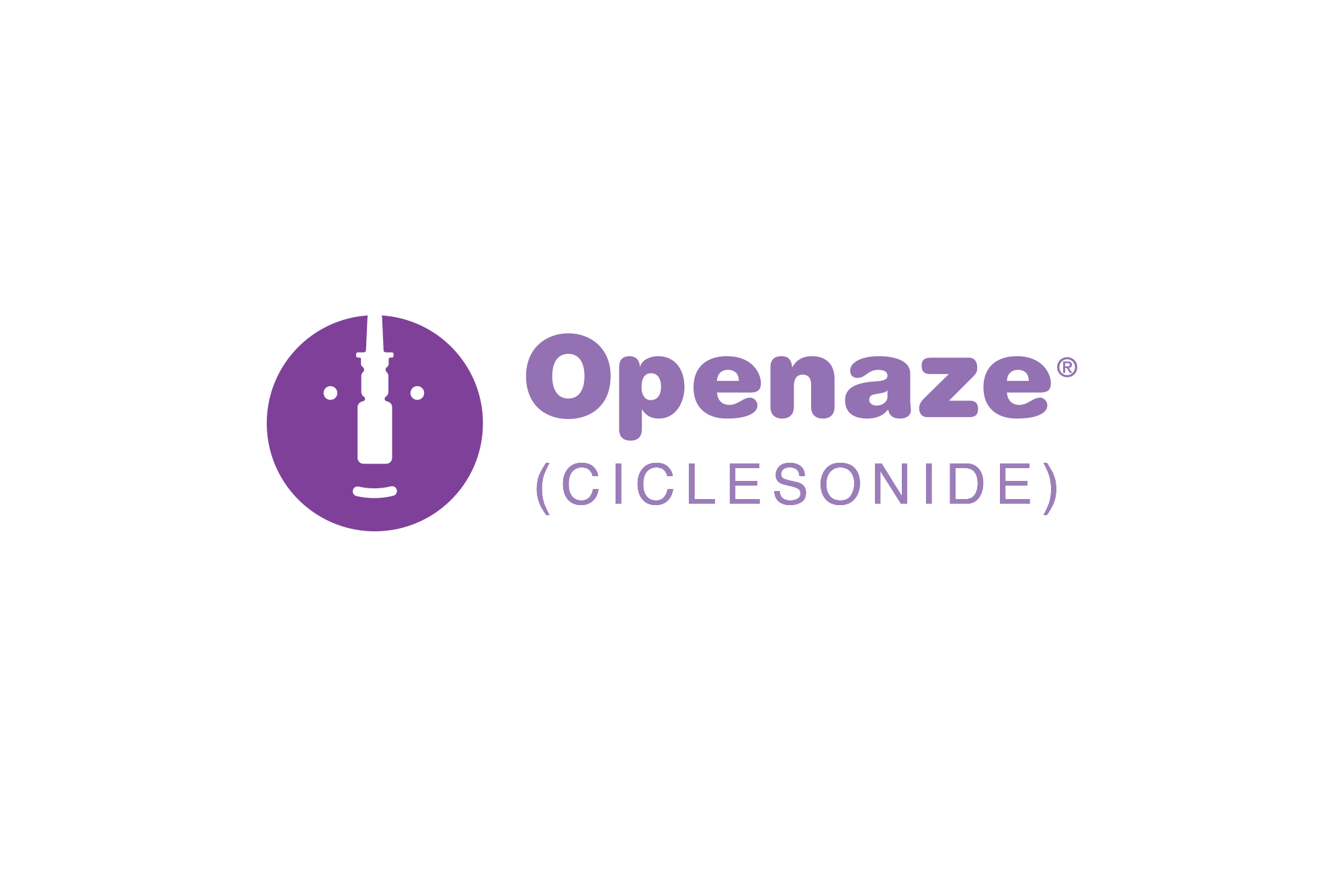
Openaze (Ciclesonide) is a nasal glucocorticoid spray for seasonal and perennial allergic rhinitis. Three identity directions developed for a competitive pitch, each exploring the sensation of openness, airflow, and relief that the product delivers.
The smiley face mark was a personal favorite. In the pharma world, the "pharma police" scrutinize every implied claim, and a smiley face next to a drug name makes regulatory teams nervous. This concept intentionally breaks that convention to show that a healthcare brand can be as patient-friendly as it is clinically credible.

Alumis is a biopharmaceutical company developing precision medicines for immune-mediated diseases. Multiple logo directions were explored, each translating the company's core values, Elevate, Challenge, and Nurture, into a distinct visual form. The top mark, three organic shapes forming an A, was selected as the final logo, with each shape embodying one of the three core values.
Preboost is a desensitizing wipe for men. The logo utilizes an interlocking double 'O' to merge the concepts of infinity and fluid movement, establishing a sophisticated brand identity that confidently normalizes a sensitive category.
Alliance for Cancer Gene Therapy is a nonprofit that raises donations to support frontline scientists working on cancer cell and gene therapy research. Multiple logo directions were explored before landing on the final mark, three overlapping circles that suggest collaboration, unity, and shared purpose. The identity extends into print materials carrying the campaign line: "The alliance with one vision. A cancer-free future."
Novartis is an interactive microsite for exploring Novartis's clinical development portfolio. The logo was designed for versatility across banners and printed ads. A dynamic radial wheel organizes pipeline compounds by therapeutic area, with each color segment representing a different disease category. Users navigate between General Medicine and Oncology, then drill into specific areas to explore compounds by development stage.
Benthic Genomics is a next-generation bioinformatics company specializing in complex and polymorphic regions of the genome. The logo uses layered wave forms to evoke the deep ocean, a visual metaphor for the dark, previously inaccessible regions of the genome that their technology brings to light.
Times Square Church is an inter-denominational congregation in the heart of New York City. The identity system is built around a single mark, an open bible, adapted across three ministries through color and a distinct icon: a candle for the main congregation, a musical note for Music Ministry, and a seedling for Children's Ministry. One cohesive system, three distinct voices. (Pro bono project)

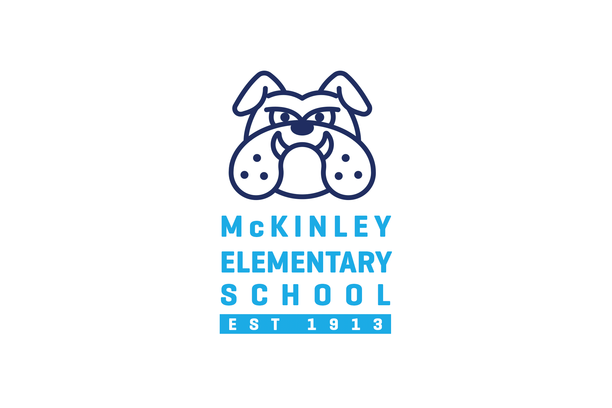
McKinley Elementary School is a public school in Burlingame, California, founded in 1913. Max the Bulldog mascot was redesigned and extended into a graphic system across occasions and campaigns throughout the school year. Each T-shirt graphic keeps the same character but gives it a fresh personality. The shirts are sold by the PTA to raise funds for the school. (Pro bono project)